
a local dashboard for my chatgpt export
I finally did something sensible with a cleaned ChatGPT export: I turned it into a static, local-only dashboard. Chart.js for the charts, a 2D UMAP “atlas” of conversations plus an optional 3D sibling view (read more about UMAP here: Understanding UMAP), and semantic search over embeddings stored in SQLite with sqlite-vss. If you have ever stared at a giant JSON dump and wanted a map instead of a scroll, this is that map.
# Summary stats
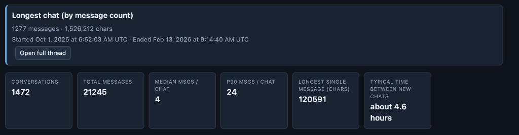
The top line is simple. In my current snapshot I have on the order of 1,472 conversations and ~21k messages. The median thread is short (about four messages), the 90th percentile is still modest (~24 messages per chat), and the tail is wild: one thread ran to 1,277 messages and well over 1.5M characters. The longest single message I have on record is north of 120k characters. “Typical time between new chats” comes out around 4.6 hours, which is a fun scalar summary of how often I spin up a fresh tab versus continuing an old one.
# Charts
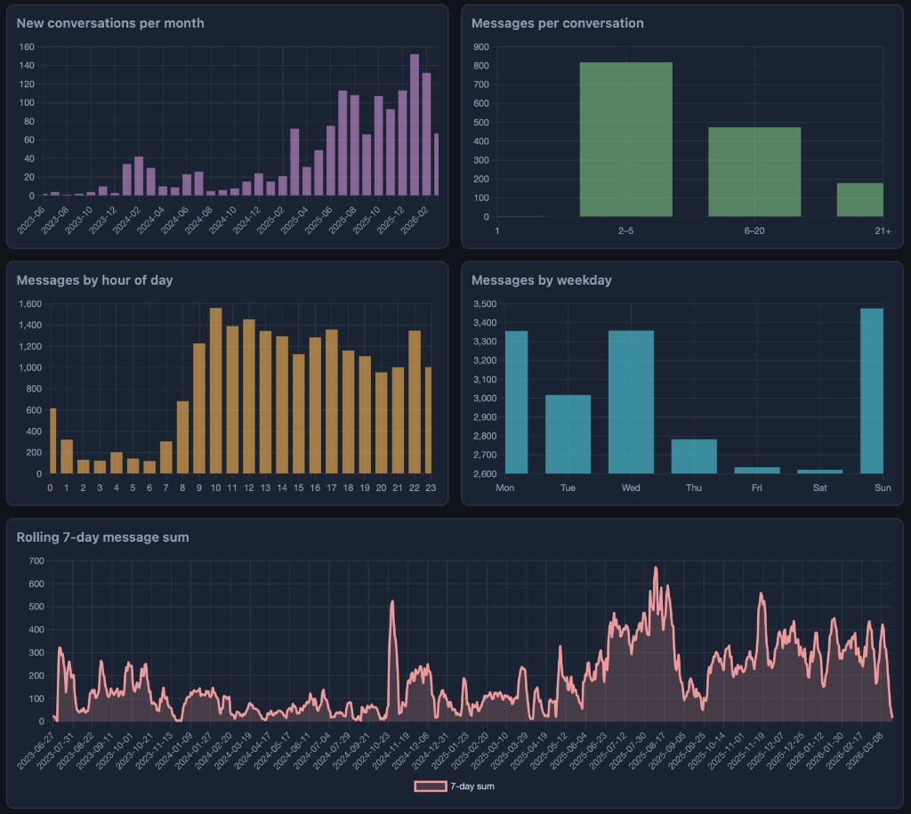
Aggregates are computed offline into a single data.json, then the page renders the usual suspects: new conversations per month, bucketed thread lengths, messages by hour and weekday, and a rolling seven-day sum. The story in my data is mostly “quiet 2023, then growth,” with most threads living in the 2-5 message bucket and usage clustering in late morning and around Sunday.
# What I ask for in titles
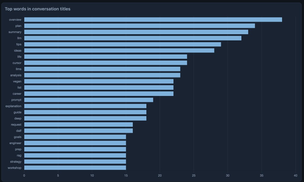
Tokenizing conversation titles and counting words is cheap and surprisingly honest. My top tokens skew toward overview, plan, summary, llm, tips, ideas, life, cursor, and other “I want a structured answer” vocabulary. It reads like my brain’s table of contents.
# The conversation atlas
The interesting part is not the bar charts. Each conversation gets one embedding vector (OpenAI text-embedding-3-large, built from title plus user text, truncated with tiktoken). Those vectors live in SQLite; UMAP turns each high-dimensional row into a point on the plane so I can plot the whole archive at once.
UMAP is a nonlinear dimensionality reduction method: it builds a fuzzy topological picture of the data and then finds a low-dimensional layout where distances still reflect how points sat near each other in the original space. The interactive Understanding UMAP page from Google PAIR walks through that idea with diagrams you can step through, which beats my one-paragraph summary.
Points are colored by year and sized by √(message count) so long threads pop visually without dominating every pixel.
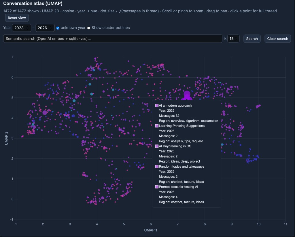
The same process also makes a second UMAP with three dimensions (instead of two). This means the 3D map is not just the 2D map with an extra axis—it’s a separate view. If embed_3d.json is present, you get a toggle for 2D or 3D. When you choose 3D, Three.js loads and you can rotate the colored points, with search still working the same way. A third dimension adds a touch more information about the convos.
# Semantic search on top of the map
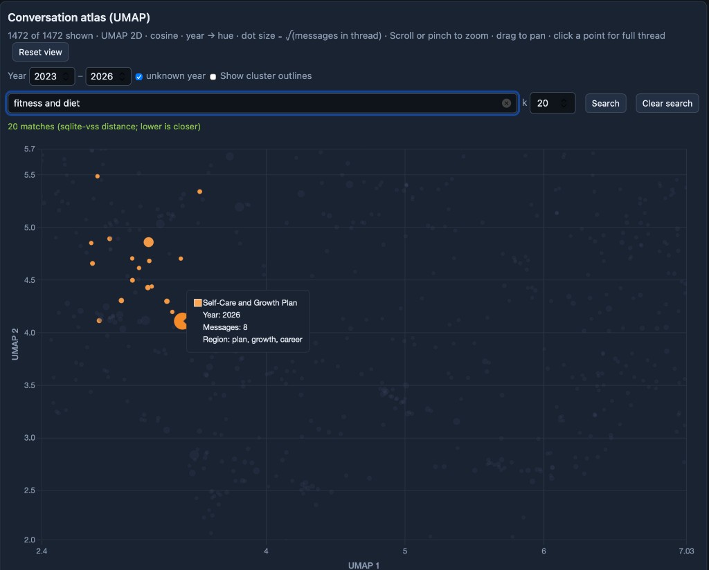
Search embeds the query with the same model, then runs k nearest neighbors via sqlite-vss (cosine-style distances in the index). Matches highlight on the atlas so you can see where a topic lands relative to everything else. Here is “fitness and diet” with k = 20:
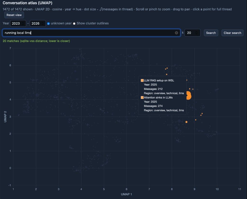
And here is “running local llms,” where the hits clump into the technical pocket I expected:
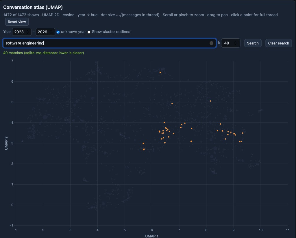
For a wider net, “software engineering” with a larger k spreads across more of the same neighborhood:
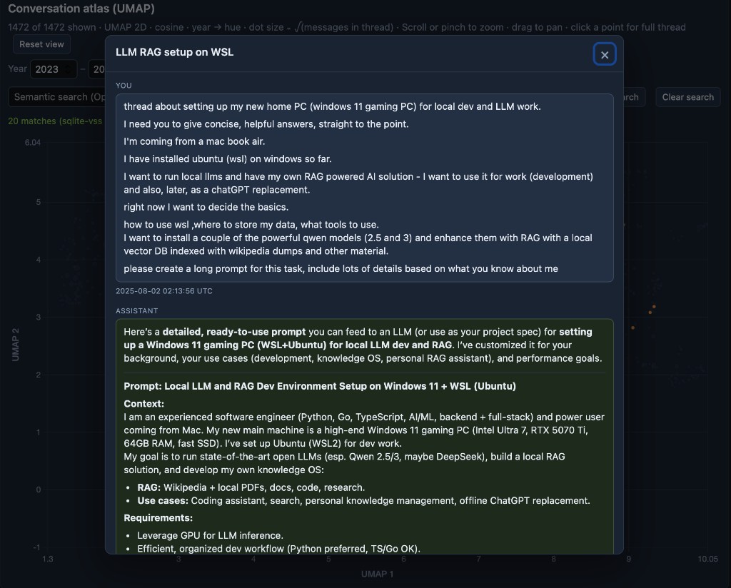
# Opening a thread
I run a tiny local server so the dashboard can load the data files and open threads on demand. Click a point on the atlas and the full conversation opens in a modal, user and assistant messages in order.
# Privacy
Private data only: I use it to explore my ChatGPT history for fun, and it is not hosted anywhere.